In this short article we’re going to go through how to make Zendesk tickets look like real emails. This is by no means a fix, but a work around until Zendesk can implement HTML formatted comments without all the other jargon such as white spacing, company name, agent name and date/time.
For those of you reading this article and have the same issue, please upvote the idea on the Zendesk community so we can have a placeholder for Zendesk formatted comments.
Current Solution: Right now the only current solution is to use unformatted HTML comments to produce Zendesk tickets which look like real emails. This comes with a few distinct disadvantages – Any HTML/Markdown formatting is not displayed (bold, italics, underline, ahref text links, etc etc). Any other inline elements such as images will also be reduced to nothing more than a link to the image.
New Solution: What we will discuss below will use a combination of HTML formatted comments for the “Latest comment” and Unformatted for the past comments. Not the most ideal solution of course, but it will make those Zendesk tickets look like real emails and work on 90% of major email clients.
Update your email settings
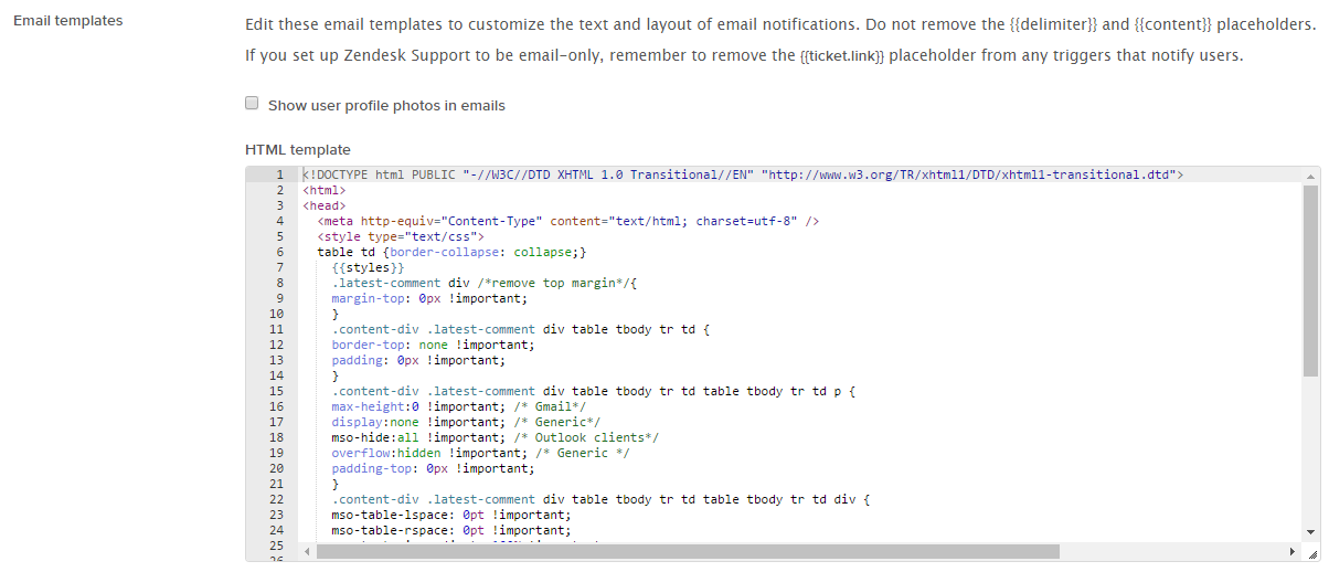
- Navigate to Settings > Email > HTML Template
- Paste the below code into your text box (make a backup of the existing code if running in a production environment)
- Untick the checkbox to display users profile image
|
1 2 3 4 5 6 7 8 9 10 11 12 13 14 15 16 17 18 19 20 21 22 23 24 25 26 27 28 29 30 31 32 33 34 35 36 37 38 39 40 41 42 |
<!DOCTYPE html PUBLIC "-//W3C//DTD XHTML 1.0 Transitional//EN" "http://www.w3.org/TR/xhtml1/DTD/xhtml1-transitional.dtd"> <html> <head> <meta http-equiv="Content-Type" content="text/html; charset=utf-8" /> <style type="text/css"> table td {border-collapse: collapse;} {{styles}} .latest-comment div /*remove top margin*/{ margin-top: 0px !important; } .content-div .latest-comment div table tbody tr td { border-top: none !important; padding: 0px !important; } .content-div .latest-comment div table tbody tr td table tbody tr td p { max-height:0 !important; /* Gmail*/ display:none !important; /* Generic*/ mso-hide:all !important; /* Outlook clients*/ overflow:hidden !important; /* Generic */ padding-top: 0px !important; } .content-div .latest-comment div table tbody tr td table tbody tr td div { font-family: 'Lucida Grande',Verdana,Arial,sans-serif !important; font-size: 14px !important; mso-table-lspace: 0pt !important; mso-table-rspace: 0pt !important; -ms-text-size-adjust: 100% !important; -webkit-text-size-adjust: 100% !important; width: 100% !important; } .zd-comment { -webkit-text-size-adjust: none !important; } </style> </head> <body {{attributes}} style="width: 100%!important; margin: 0; padding: 0;"> <div class="content-div" style="padding-left: 10px; padding-right:10px; line-height: 18px; font-family: 'Lucida Grande',Verdana,Arial,sans-serif; font-size: 14px; color:#333;"> <!--<div style="color: #ffffff;">{{delimiter}}</div>--> {{content}} </div> </body> </html> |
Update/create your trigger
- Navigate to Settings > Triggers > New/Update trigger
- Paste the below HTML into your trigger
(NOTE: Ensure there are no white spaces in your HTML – from testing we’ve realized this messes with the output)
|
1 2 3 4 5 6 7 8 9 10 11 12 13 |
<div class="latest-comment">{{ticket.latest_public_comment_formatted}}{% for comment in ticket.comments offset:0 limit:1 %}{% if comment.attachments.size > 0 %}<br /><br />Attachments: {% for attachment in comment.attachments %}<br />{{forloop.index}}. <a href="{{attachment.url}}">{{attachment.filename}}</a>{% endfor %}{% endif %}{% endfor %}<br/><br/></div> <!--<div>INSERT HTML SIGNATURE IF YOU WOULD LIKE</div>--> </br> {% for comment in ticket.public_comments offset:1 %} <div style="margin-top: 10px; border-top: 1px solid #bbb;">On {{comment.created_at_with_time}}, {{comment.author.name}} wrote: <br/>{{comment.value}} {% if comment.attachments.size > 0 %}<br /><br />Attachments:{% for attachment in comment.attachments %}<br /> {{forloop.index}}. <a href="{{attachment.url}}">{{attachment.filename}}</a> ({{attachment.url}}) {% endfor %} {% endif %}<br /> {% endfor %} {% for comment in ticket.public_comments offset:1 %}</div> {% endfor %} |
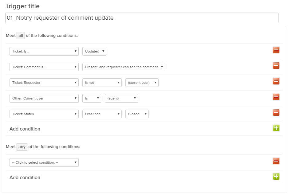
And for those who need to know what the trigger should look like.
Hopefully this was helpful – Please leave your comments with any feedback or other suggested improvements!
 MooMetric.com Integrating marketing and business metrics using code and non code solutions.


This would be the perfect solution if this wasn’t an issue: Any HTML/Markdown formatting is not displayed (bold, italics, underline, ahref text links, etc etc). Any other inline elements such as images will also be reduced to nothing more than a link to the image.
If we could retain html and inline images we would have perfection. I would love to know if anyone comes up with a solution for that.
Tip: to make it further look like outlook edit to the following:
From: {{comment.author.name}} Sent:{{comment.created_at_with_time}} To: {{ticket.requester.name}}Cc: {{ticket.cc_names}} {{comment.value}}
Hi Alex – Thanks for your input and the tip. The first email should be displayed in HTML so there are no issues with formatting or markdown. The trailing emails i’ve simply done using the unformatted comments placeholder. That way any emails sent using the web interface by the agent will include all the formatting that they provided.
RE your tip: Good for anyone who is looking to make it look almost identical to an email, thanks for that. For us it was close enough that it still looked nice and neat 🙂
Agree that this whole solution isn’t perfect – be great if Zendesk could just create a formatted HTML comments placeholder… sigh.
Hello Moo Master,
I’ve been asked by my company to make Zendesk emails look like regular emails. We get two complaints from our customers about Zendesk quite often. 1. The email I get from Zendesk does not look like an email. 2. The attachment link at the bottom of the reply. Looking at your code it appears that you have some control over where the attachment link is placed. Is that correct?
Do you offer any Zendesk customization services?
Thank you.
Hi Scott,
I haven’t tested, but i believe it is possible to shift the attachment to the top of the reply email. It’s for sure not as neat, but there are limitations as you know with how Zendesk handles attachments. Please comment and let me know what other customizations you’re looking for, or send me an email direct – [email protected]
Hello Moo Master,
I’ve followed the steps outlined but for some reason, any attachments are being stripped from the resulting emails. Any thoughts as to why this might be happening?
Hi Matthew – that’s for pointing this out. Seems there was an error in my original for loop. Please use the latest code from this post and let me know if it has fixed the problem
Realizing I forgot to let you know…the fix worked! Thanks for the speedy assistance!
Me again Mr. Moo Master! I’m having another problem implementing this code; can’t recall if this was introduced with the fix made recently. Regardless, the code seems to be ignoring the {{delimiter}}. All replies made via email are including all other previous comments, making a mess of the thread. Would you mind looking into this? Thanks in advance!
Hi Matthew,
Is it Agent replying via email or Customer replying via email which are copying the entire thread upon each reply (or both ways)?
Is it also for every ticket reply, or just a select few replies which is making a mess ?
Tested and it appears to be both ways on every ticket. Essentially every time either an end-user or Agent replies via email, it’s taking the new comment, but also including all other previous comments.
I was looking to implement this, but have found same thing. If agent responds via email, it creates a private note in the ticket, but then if agent sends customer update from Zendesk, the notification to customer includes the private note.
Is there any solution?
Hey The Moo Master,
Thanks for putting this together!
I am having one problem when implementing this though. It seems like it’s cutting off the last few lines when I receive the email in Gmail. There must be some placeholder still there because there is a rather large gap between the end of the email and the start of the next message in the chain. I’ve copied and pasted exactly what you put in for the email and macro. Any idea what might be causing this?
Thanks again. You rock!
Hey The Moo Master,
Please disregard my last comment. Through some brute force commenting I’ve found that line:
display:none !important; /* Generic*/
seems to be the pulling my signature (the end of the comment) out of my emails. I understand now that the signature is considered a part of the native zendesk formatting that would be taken out with the name/date/etc at the top. My problem was that with the 20 or so people working through my zendesk account I thought it would be easier just to tack a signature onto the end of each comment rather than make a dynamic HTML sig that would work for everyone… at least while we are still trying out the email features. For the time being I just replaced the signature div in the trigger with a user_signature placeholder and that seemed to do the trick.
Thanks again for the great template. I really appreciate it!
This is great! Thank you for taking the time to share this. I noticed that the template overrides the default delimiter and injects random text instead. Here’s the in the final email delivered to Gmail inbox.
[YMMML5-6V7V]
Do you know why this happens? If possible, I’d like to customize this text and use the delimiter setup on Zendesk.
This is currently a problem in GMail previews when there’s short text or on mobile. Otherwise, it’s all great!
This mostly works but the gmail client still doesnt collapse down the previous emails automatically. So when you open a new zendesk reply email, it fills your whole screen. Anyone have a workaround?
It doesn’t work with the zendesk support app. The comment isn’t shown.
Any ideas?